What you need to know about Ohio Politics and Policy
Stephen Dyer · September 4, 2013
New school report cards more balanced, but not enough to overcome demographics
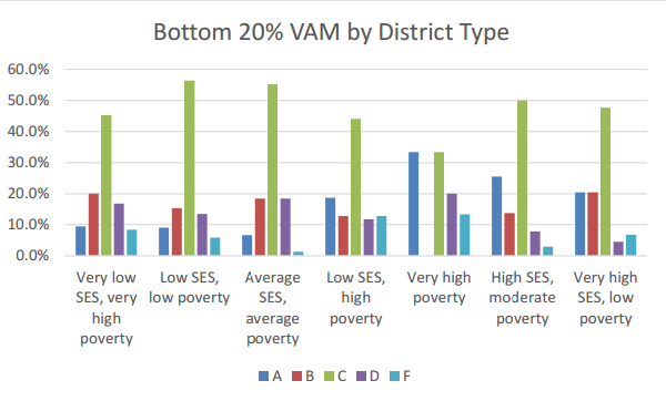
As we continue to digest the latest Ohio Report Card, Innovation Ohio has analyzed the grade distribution in each of the 9 new measures in which districts receive A-F letter grades by type of district. Ohio district typeology is something the state has done for years in order to attempt to break down Ohio’s 613 districts into more manageable chunks. The types of districts are as follows: 1) Rural very low socioeconomic status (SES), very high poverty 2) Small Rural, low SES, low poverty 3) Small Town, average SES, average poverty 4) Urban, low SES, high poverty 5) Major Urban, very high poverty 6) Suburban, high SES, moderate poverty 7) Suburban, very high SES, low poverty Essentially, the poorest districts are category 1 and 5, while the wealthiest districts are the suburbans. Districts like Cleveland are Major Urbans, while urban districts are districts like Sandusky or Mansfield. These categories are helpful, especially after the Ohio Supreme Court school funding case, to determine where state money is being directed and whether that is fair. It was the categories that allowed analysts to discover, for instance, that most of the benefit to Gov. John Kasich’s original school funding plan from February would flow to the wealthiest districts in the state while leaving the rural poor districts (who filed the original school funding lawsuit in the 1990s) behind. In the case of the new Report Card, the results are less strikingly pro-wealthy district than the previous report card where 98% of the richest suburban school districts got As or A+s and all the Ds and Fs (save one) came from the state’s poorest rural and urban districts. But the new report card still favors wealthy districts to a great degree. For example, in the Annual Measurable Objectives (replacing Adequate Yearly Progress) category, meant to measure the performance of subgroups of kids based on several different demographic characteristics, every major Urban District received an F. Meanwhile, about half of suburban districts get As and Bs. Another example is overall Value Added (student growth), which shows that 89% of the wealthiest districts in the state got As, while over half of Major Urban districts received Fs. [See all the grade distribution charts] However, some categories showed not as great a divide between districts. For example, in the Value Added Measure that looks at growth among the bottom 20% of learners — a category that media have shown that some traditionally poor performing districts actually did better than their traditionally high performing counterparts, nearly the same percentage of As came from high and very high poverty districts as suburban districts. However, 59% of all Fs came from the high and very high poverty districts.
(click for full size chart)
What the data breakdown shows is this: There remain huge performance differences between wealthy suburban and poor urban and rural districts. These differences, though, do not seem to be quite as stark as they were under the previous Report Card. Whether we should be judging districts based on a few tests in a few subjects taken only during a few years of a child’s education is a serious question. But it appears the state is doing a somewhat more nuanced and intricate analysis of those quite limited data points. And that’s a positive step.
We have provided bulleted highlights of each category, along with charts showing the grade distribution among the categories for each district type so you can go through and see the differences for yourself. We will do a similar analysis based on the percentage of children a district has living in poverty. Test scores are so closely related to poverty that using it as a comparison will present a challenge for these new metrics to overcome.Tagged in these Policy Areas: K-12 Education


